Overview
Feature testing is a crucial step in the design process. This case study showcases a usability test conducted for EasyJet to evaluate and refine a proposed redesign of the app’s booking flow.
My Role
Research planning and execution, prototyping, data analysis
Duration: June 2019
Research focus
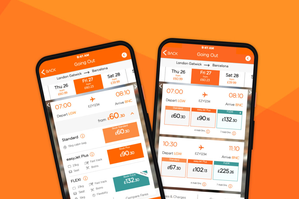
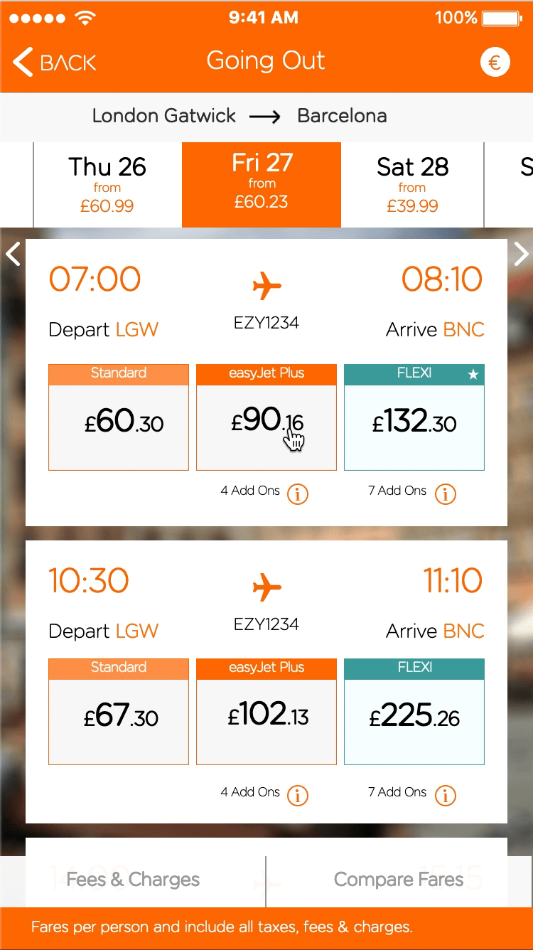
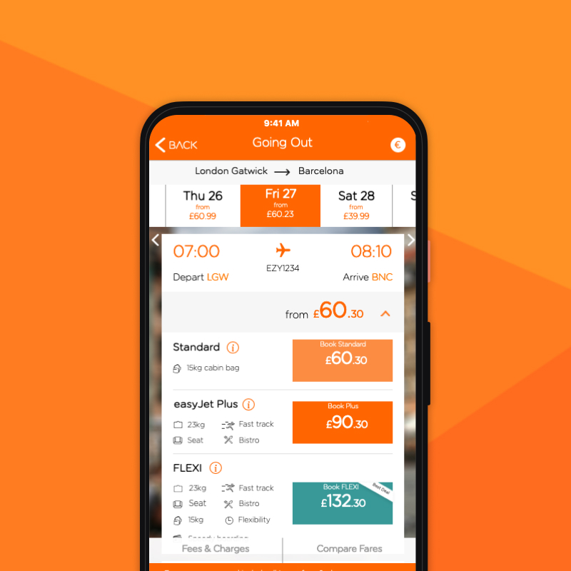
In June 2019, EasyJet explored the introduction of a new fare structure, which would affect search results, upselling of ancillary services, and seat selection within the booking flow. Our design team proposed two design solutions to reflect these changes and tested them through a usability test.
This study aimed to validate and compare different design approaches for:
- New fare display
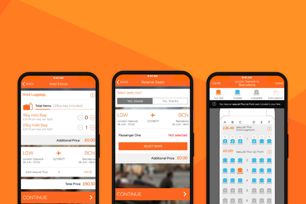
- Ancillary services selection
- Seat selection flow
Planning
Effective research begins with solid planning. A comprehensive research draft was created to align stakeholders and guide the process. The draft included:
- Objectives and research questions
- Chosen research methods
- Recruitment criteria
- Documentation (screeners, scripts)
- Timeline
- Budget
Method
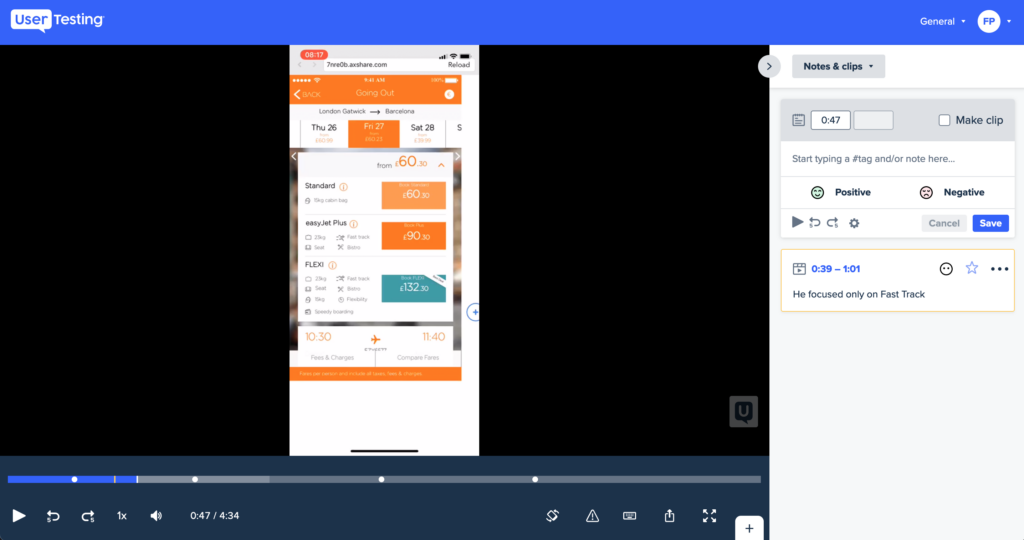
To capture natural user behaviour, we conducted an unmoderated remote usability test using high-fidelity Axure prototypes via usertesting.com.
Participants were divided into two groups and followed a structured test scenario:
- Intro/Scenario: realistic travel context setup
- Select a Target Fare: assessed understanding of each design
- Interpret Included Services: evaluated clarity of fare content
- Add Extra Bag and Select a Seat: tested consistency in behaviour
- Post-Test Questionnaire: captured overall impressions and feedback
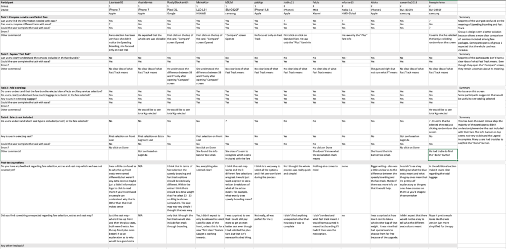
Analysis
The analysis involved reviewing session recordings and coding key behaviours. We used usertesting.com’s video tools to extract insights and align findings with the initial questions.
This process helped identify behavioural patterns and usability challenges and supported or disproved our hypotheses.
Annotations were systematically organised in a spreadsheet based on the research questions, helping to highlight behavioural patterns.
Findings
Both design solutions performed well overall. However, the vertical fare layout offered a clearer comparison of services, supporting more informed decisions beyond just price.
Additional issues were observed, such as confusion around seat map interactions and a lack of clarity about included services—insights that extended beyond the original research scope.
Outcomes
The research revealed that both design solutions demonstrated comparable usability performance, confirming they were both viable for implementation.
Beyond the fare selection component, the study also uncovered valuable insights across other areas of the booking flow.
These findings enabled the team to address minor interaction issues and implement enhancements that further improved the overall user experience of the app.