Overview
An expert evaluation was conducted as part of a consultancy project to identify and highlight the strengths and weaknesses of our partner’s product.
My Role
Research planning and execution, data analysis, deliverables
Duration: Jen 2020 – Feb 2020
Research focus
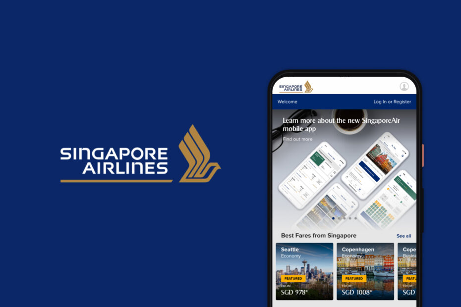
This project presents an expert evaluation conducted by our design consultancy team for Singapore Airlines. The aim was to assess the usability of the Singapore Airlines mobile app using established heuristics, design guidelines, and expert experience to identify and prioritise usability issues.
Methodology
An expert evaluation involves a usability review of a product’s interface by two or more specialists. Issues are identified, rated by severity, and accompanied by actionable recommendations to enhance the user experience.
This approach effectively uncovers minor issues that might go unnoticed in user testing (such as UI or brand inconsistencies) and more significant problems that contradict established design principles, allowing them to be addressed before investing in user testing logistics.
Phase 1 • Qualitative evaluation
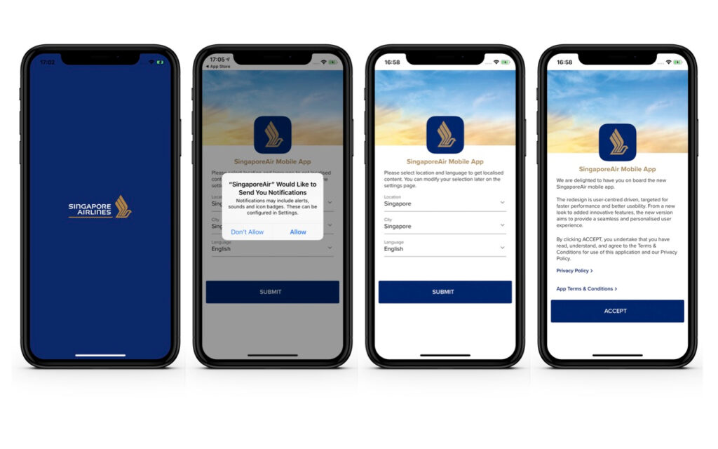
Five expert designers from our team evaluated the Singapore Airlines app against two key competitors: Emirates and American Airlines. Each app was assessed across four core touchpoints:
- Onboarding screens
- Homescreen
- Flight search
- Fare selection for a return flight
Phase 2 • Scorecards
To complement the qualitative data with tangible usability KPIs, we benchmarked the different apps by creating Design Scorecards. Each expert completed a survey capturing key metrics such as usability, visual appeal, satisfaction, and likelihood of continued use. The survey incorporated standardised tools, including:
- SUPR-Q – Standardized User Experience Percentile Rank Questionnaire
- SUS – System Usability Scale
- CSAT – Customer Satisfaction Score
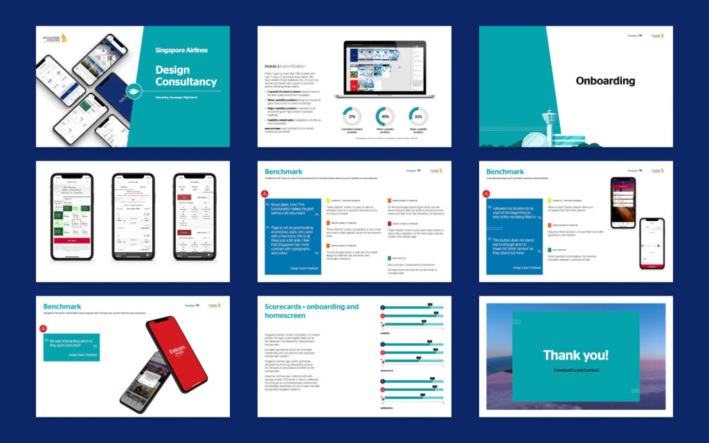
Phase 3 • Prioritization
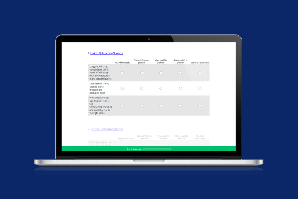
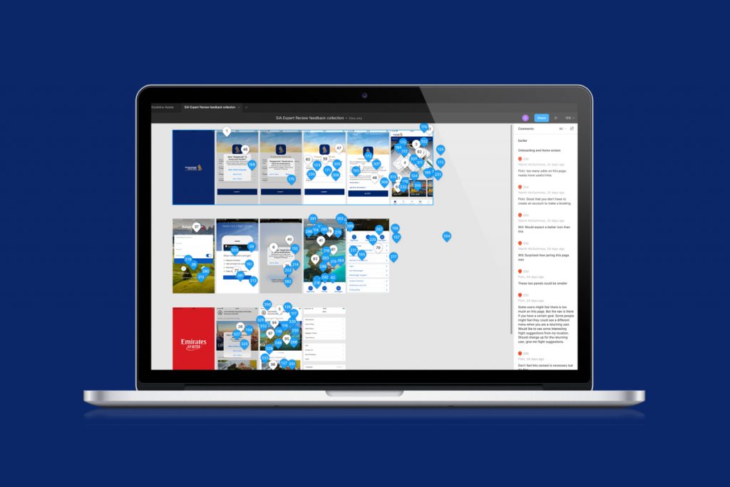
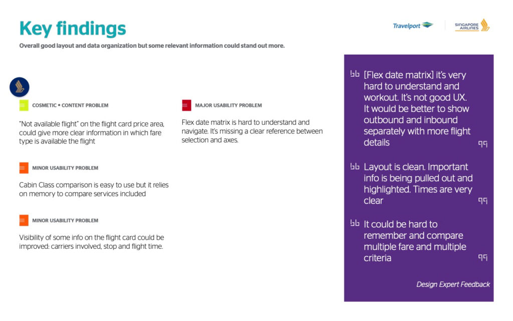
Phase 1 generated over 350 individual observations and more than 7 hours of recorded sessions. We synthesised this into 39 recurring themes, which were ranked by severity:
- Cosmetic/content issue – fix only if time allows
- Minor usability issue – low priority
- Major usability issue – high priority
- Usability catastrophe: imperative to fix this as soon as possible
Deliverables
Findings were compiled into a presentation delivered to the client. This summary highlighted key strengths and weaknesses of the Singapore Airlines app, benchmarked against its competitors using both qualitative and quantitative insights.
Outcomes
Identified 39 recurring usability issues across key user journeys, prioritised by severity to guide future improvements.
Benchmarked Singapore Airlines app against Emirates and American Airlines, highlighting strengths and weaknesses in usability, visual design, and user satisfaction.
Generated quantifiable UX metrics using standard tools (SUPR-Q, SUS, CSAT), enabling data-driven decision-making.
Delivered a clear, actionable summary report to support design enhancements and align stakeholders.